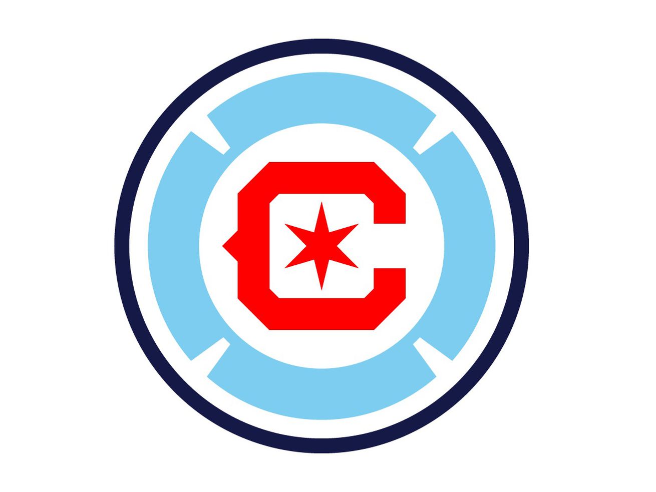
The mark will be worn starting in 2022, and the current “Fire Crown” logo will be retired after the 2021 season.
The Fire hope they finally got their logo right.
Frankly, they had to.
After it leaked on social media earlier in the day, the Fire unveiled their new badge Friday night. The circular mark features a red C with a six-pointed star, surrounded by a Chicago flag-blue Florian Cross, all inside a navy blue circle with a white background.
Created by designer Matthew Wolff after a process of consulting with fans that began in January, the mark will be worn starting in 2022. The current “Fire Crown” logo, a subject of derision even before it was released in November 2019, will be retired after the 2021 season.
“As much as this project was about the creation of a new crest for the Chicago Fire, it was also about renewing a spirit of cooperation and collaboration with our fans,” Fire owner Joe Mansueto said in a news release. “We made a commitment in January to welcome anyone who wanted to lend their voice to this project and the result is a crest that was fully and completely inspired by what we heard from our fans and supporters.
“We’re hopeful all will wear the new crest with pride and feel it represents not only this storied club, but also the great city of Chicago.”
The Fire also announced they will return to red home kits starting with the 2024 season. The 2022-23 home uniforms have been in design for over a year and will remain blue. Their current white secondary kits will be worn for a second season in 2022 but with the new logo.
An eventual return to red at home will help the Fire get closer to the identity they spurned after the 2019 season. Starting with the birth of the franchise until two years ago, the Fire had a consistent visual signature: the classic Florian Cross-inspired blue, red and gray badge worn on an all-red primary uniform that featured a prominent horizontal white stripe across the chest.
Since then, they’ve worn blue at home with the loathed Fire Crown badge, which was mocked by neutrals when it was unveiled and never caught on with supporters.
This logo has to, because the Fire cannot afford to change their badge again. When they take the field in 2022, they’ll be donning their third logo in four years, an extremely rare level of inconsistency in major-league sports that complicates recognition.
Earlier this year, Mansueto acknowledged that changing logos isn’t good for building a brand. This mark must last, and not just for a little while as the team tries to gain relevance in the Chicago sports market.
“It’s hugely important,” Mansueto told the Sun-Times. “We need to get it right. We made one change, which is not that unusual. What’s unusual is to make two changes, that you introduce something and it’s not quite the right fit.”
The Fire said fan involvement in this rebrand included over 225,000 words submitted to the team website, more than 500 hours of supporter roundtables, and beyond 10,000 responses on social media.
